How to create an effective landing page
One page, one goal: headline, social proof, a form and mobile first for campaigns that convert.

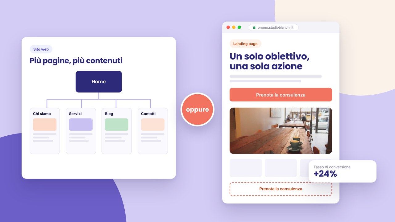
An effective landing page has a single task: bringing the visitor to take a precise action — subscribe to a newsletter, download a guide, request a quote, buy a product or register for an event. No distracting menu, no links that take people away from the goal. A clear message, proof of credibility, a visible call to action.
This guide explains how to design, write and publish a landing that converts, with attention to mobile, SEO, campaigns and compliance. Whether you launch a seasonal promo or a Google Ads campaign, the structure stays the same: focus, simplicity, measurement.
What a landing page is and when to use it
By definition a landing is a page (or a dedicated URL) designed for a single conversion goal. It does not replace the whole business site: it sits alongside it. Typical examples:
- webinar or event sign-up — often linked to a wider website for events;
- a lead-magnet download (PDF, checklist, template);
- a quote request for a specific service — a complement to the professional business website;
- the sale of a product or a time-limited package;
- the destination page of social or email campaigns with tracked UTMs.
If your goal is to present the whole company with more services and SEO pages, you need a multi-page site, not a single landing. Compare in multi-page site vs one-page: the landing is a one-page by definition, but with a campaign purpose, not a generic shop window.
Elements that convert
Every section must push towards the action. Here are the blocks that cannot be missing.
Headline: the benefit in evidence
The main title answers “What do I get?” not “Who are we?”. Weak examples: “Welcome to our offer”. Strong examples: “Reduce quote times by 40% with a digital flow” — if the figure is verifiable. Be specific about the audience when needed: “For accounting firms with up to 10 collaborators”.
Subtitle: for whom and how
A line that clarifies who the offer is aimed at, what it includes and any real urgency (registration deadline, limited places). Avoid empty hype.
Social proof and credibility
- testimonials with name and context;
- client or partner logos (with authorisation);
- concrete numbers: subscribers, reviews, years of activity;
- a screenshot or preview of the product/service;
- certification badges if relevant to the decision.
Page body: objections and clarity
Compact sections that anticipate doubts: how it works, what happens after the click, the price or “free”, times, guarantees. Use a bullet list, light icons and short paragraphs. A wall of text kills conversion on mobile.
A form or CTA above the fold
The button or the form must be visible in the first screen on a smartphone, or immediately after a short headline. Repeat the CTA at the end of the page for anyone who has scrolled everything. The same text or consistent A/B variants.
What to remove (and why)
The landing wins by subtraction. Remove everything that competes with the goal:
- the complete menu of the main site — at most a logo that links to the home and minimum legal links;
- a hyper-linked footer with twenty items;
- generic text copied from the company home without adaptation;
- autoplay video with audio that disturbs;
- aggressive popups before the visitor has read the offer;
- links to social, the blog and articles not related to the action.
Every extra element increases the probability of exit. If more context is needed, add an FAQ or “How it works” on the same page, do not send people elsewhere.
Mobile first: where conversion is played
Most traffic from Meta, Google or email campaigns arrives from smartphones. Optimise for mobile before desktop:
- a large CTA button, sufficient contrast, distance from other links;
- a short form: name, email; phone only if indispensable for follow-up;
- large fields, clear labels, the correct keyboard (email, tel);
- fast loading: compressed images, few scripts, no heavy sliders;
- a test on a real device, not only an emulator — try with a 4G network.
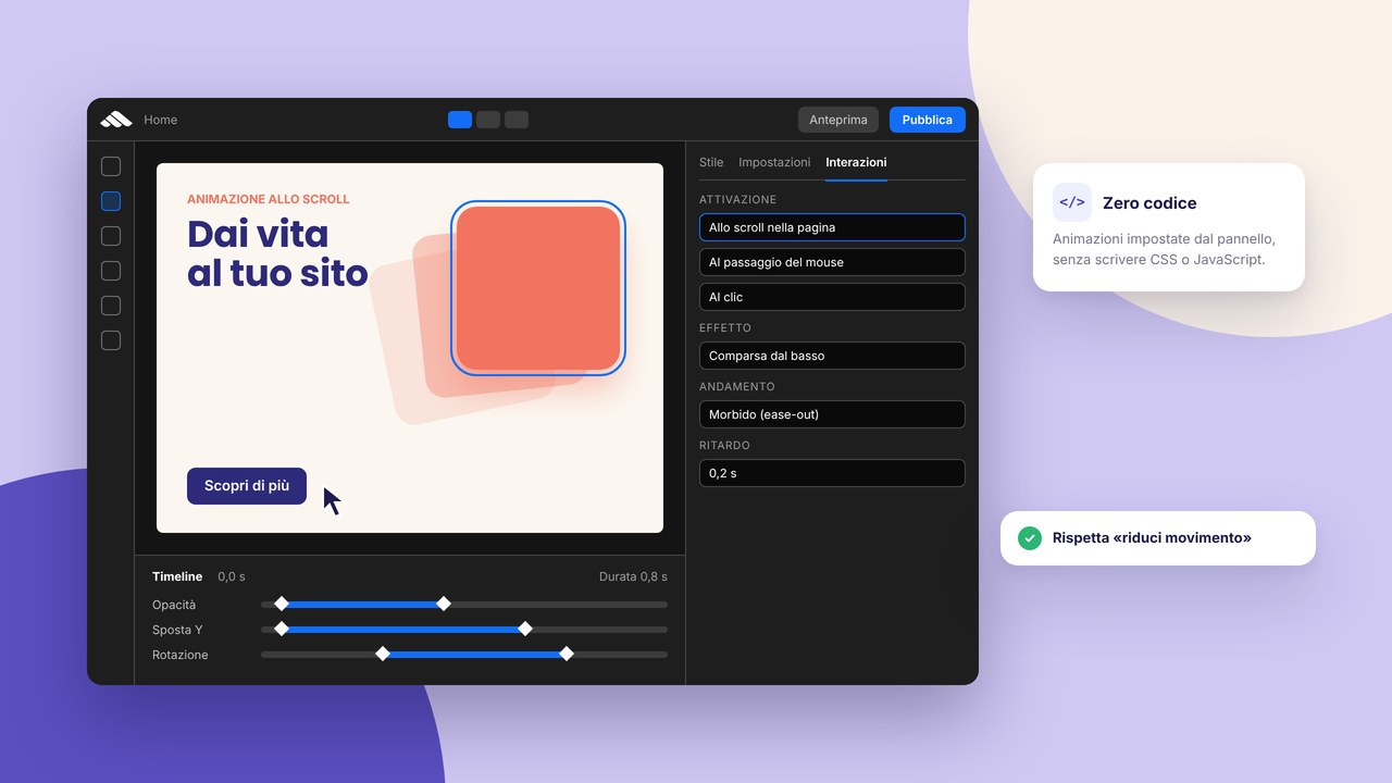
Light animations can guide the eye towards the CTA; avoid effects that delay the initial paint. Ideas in interactions and animations without code in the builder.
SEO and campaigns: two modes, the same basics
A landing can be:
- indexed — specific keyword targets, carefully made meta tags, internal links from the main site;
- not indexed (noindex) — only paid or email traffic, to avoid cannibalisation with service pages.
In both cases you need meta title and description consistent with the offer, even if the page is noindex (useful in social previews and perceived quality). A guide: meta title and description for beginners.
For local landings (e.g. “corso Excel Prato marzo 2026”) integrate natural geographic references and connect the local strategy described in local SEO in Prato and Tuscany.
Avoid typical brochure-site mistakes even on landings: duplicated titles, thin content, keyword stuffing — see SEO mistakes to avoid on brochure sites.
Step by step: from the brief to an online landing
- Define the single goal — one measurable primary conversion only.
- Know the audience — pain, desire, main objections.
- Write the headline and subtitle — at least three variants to test.
- Structure the sections — hero, proof, benefit, how it works, FAQ, final CTA.
- Design a minimal form — essential fields, a clear post-submit message.
- Choose a template or layout — consistent with the brand; personalise, do not copy — templates.
- Implement tracking — conversion events, campaign UTMs, GDPR compliance — HTTPS and cookie banners.
- On-page SEO — title, description, H1, image alts.
- Cross-device testing — the form, the thank-you page, the confirmation email.
- Publish — follow how to publish a site with the builder in 10 steps and the go-live checklist.
- Monitor and optimise — conversion rate, scroll, title/CTA variants.
Reusable components and iteration speed
Campaigns require frequent variants: the same structure, a different headline, an alternative CTA, a seasonal image. Save hero sections, testimonial blocks and forms as reusable components in the builder: you update once, you replicate on more landings. Time savings explained in reusable components.
For SMEs that launch more than one promo a year, this approach beats redoing the layout from scratch every time. Connect the landings to the main site with discreet links (“Back to the site”, the logo) without reintroducing complete menus.
How much a landing costs in 2026
A well-made landing costs less than a complete site but is not “free” if it includes professional copy, photos, CRM integrations and A/B tests. Indicative ranges and cost items in how much a website costs in 2026 with a builder and for the local context a website in Prato: costs and timings.
For rapid deliveries with a clear perimeter, also consider building a website for SMEs in Tuscany: often a landing is the first step before the multi-page site.
Useful links with other formats
- A portfolio site — if you sell creativity or made-to-measure projects: how to create an online portfolio website.
- A product catalogue — a single-product landing vs a complete catalogue: an online product catalogue.
- A blog — articles that feed traffic towards related landings: a professional blog.
- A restaurant or venue — a menu promo or a gastronomic event: a website for a restaurant.
Common mistakes that lower conversion
- A multiple goal — newsletter sign-up + purchase + a phone call on the same page without a hierarchy.
- Vague headlines — no measurable or recognisable benefit.
- A long form — every extra field reduces completions; ask for the rest later.
- Absent or generic proof — “Satisfied clients” without a name or a figure.
- A CTA hidden under infinite scroll on mobile.
- High loading times — abandonment before the message.
- Fake timers or invented urgency — it damages trust and can violate advertising rules.
- An absent or confusing thank-you page — the visitor does not know whether the action went through.
- No real test — only desktop, only Wi-Fi, only an internal colleague.
A checklist for a landing ready for launch
- A single defined and trackable goal.
- A headline with a clear benefit; a subtitle for the audience and the offer.
- A CTA or form visible above the fold on mobile.
- Verifiable social proof (testimonials, numbers, logos).
- Short sections: benefit, how it works, FAQ if needed.
- Distracting menus and links removed or reduced to the minimum.
- A tested form: submit, email, CRM, error message.
- A thank-you page with the next step (calendar, download).
- Consistent meta title and description; noindex if planned.
- HTTPS, privacy, a cookie banner if tracking — GDPR ok.
- Optimised images; descriptive alts.
- A test on a real smartphone with a mobile network.
- UTMs or campaign parameters documented for analytics.
Before full go-live, a quick SEO audit in 15 minutes intercepts technical problems even on a single page.
After publication: measure and improve
Publishing is not the end of the work. Monitor:
- the conversion rate (visits → leads or sales);
- traffic sources (ads, email, organic);
- scroll depth and drop-off on the form;
- headline/CTA variants in controlled tests.
Analytics and pixels require a correct legal basis. Do not load tracking scripts without a notice and a banner where needed — go deeper in HTTPS and GDPR cookie banners.
If the landing does not convert, change one variable at a time (title, hero image, form length) instead of redoing everything. Document what works so you can reuse it in reusable components and future campaigns.
Frequently asked questions (FAQ)
How long should a landing be?
It depends on the complexity of the offer. A free download can be enough with a few sections; an expensive B2B service often requires more proof and FAQs. A practical rule: every section must answer a real doubt; cut the rest.
Better a separate landing or a section in the main site?
Separate (a dedicated URL) when you run campaigns with a specific message and want zero distractions. A section in the site when the offer is permanent and must rank organically together with the rest.
Should I index the landing on Google?
Yes if you target stable organic searches. No (noindex) if it is only an ads/email destination and you risk competing with already existing service pages.
How many fields in the form?
The indispensable minimum: often email alone or name + email. Phone if the sale goes through an immediate call. Every additional field has a cost in conversion.
How do I choose the button text?
A verb + a benefit: “Download the guide”, “Book the free demo”, “Request a quote in 24h”. Avoid a generic “Send” without context.
Does the landing replace the business site?
No. It is a tactical tool. For a complete company presence you need a professional business website with structured services, about us and contacts.
Can I use the same template as the site?
Yes, if you simplify the layout and remove navigation elements. Visual consistency helps trust; see why the template alone is not enough in a professional site beyond the template.
A/B variants and tests without wasting budget
You do not need a data-science team to improve a landing: test one variable at a time for two weeks or until a minimum statistical volume. An alternative headline, CTA colour, section order (proof first vs benefit first), form length. Document results: a winning headline for a webinar can fail on a B2B quote. Reuse winning elements as components in the builder for future campaigns.
Watch seasonality: a “Black Friday” landing should be archived or redirected after the promo, not left indexed with an expired offer — SEO and trust damage. For recurring events, clone the structure and update dates, prices and speakers.
Accessibility and legal clarity
Sufficient contrast between text and background, visible focus on forms and buttons, explicit labels on the fields. Do not use colour alone to communicate urgency or an error. If the offer includes a free trial or a subscription, indicate conditions near the CTA, not only in the small legal footer. Transparency increases qualified conversion and reduces post-lead disputes.
Integration with email and CRM
After submit, automate a confirmation email with a summary of the offer and the next step (a calendar link, a download). Connect the form to the CRM or to a shared sheet if the volume is low — the important thing is that no request stays unanswered within 24–48 working hours. A fast landing but a slow follow-up cancels the advantage of the initial conversion.
The thank-you page and post-conversion nurturing
After the form is sent, the thank-you page is not a detail: it confirms success, repeats what happens within how much time, offers a calendar to book a call or the promised download link. Avoid an immediate redirect to a generic home. Track conversion on this page too, to measure real completions vs CTA clicks without a submit.
If the goal is a B2B lead, a short email sequence (confirmation + case study + call invitation) increases show rate. The landing has taken the first step; the human or automated follow-up closes the loop.
Landings by sector: quick examples
Consulting: a headline on the outcome, 3 benefit bullets, a testimonial with a role, a name+email+company form, a “Book a free 20 min diagnosis” CTA.
An online course: a synthetic programme, the teacher with a photo, price and a guarantee, FAQs on access and duration, an “Sign up now” CTA.
An event: date and city in the hero, speakers, early bird, ticket links — go deeper in a website for events.
A venue / restaurant promo: an event menu, a dish photo, table booking — see a restaurant site.
Conclusion and the next step
An effective landing page is focus, clarity and measurement. Define a goal, remove distractions, optimise for mobile, test the form and improve with real data.
To create and publish quickly, sign up to the builder, explore the templates or ask for a consultation. For a complete project visit the website creation service in Prato; you will find other deep-dives on the blog.