Reusable components: save hours of work
Save sections as components and reuse them on more pages: consistent CTAs, cards, FAQs and footers without starting from scratch every time.
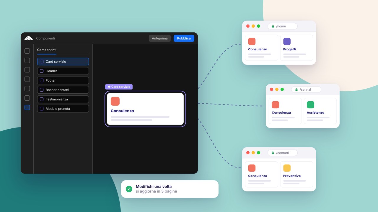
Rebuilding the same CTA section on five pages is not design: it is repetitive work. Reusable components in the builder let you save a block once and insert it where you need it, with visual consistency and fewer mistakes.
What is worth saving as a component
- A hero with a title + the main button
- Repeated service or pricing cards
- FAQ blocks
- A footer with legal and social links
- Testimonials or client logos
The feature is also described on the components product page.
How to work without ending up in chaos
Name components well (“CTA — Quote”, “FAQ — Hosting”) so you can find them in the library. Start from a “master” version on the most complete page, then save. When you update the design system (global colours, fonts), many instances align automatically; local changes on a single instance stay local until you update the source.
Instance vs library
Changing an instance on the Contact page does not change the component in the library — useful for variants (e.g. a different CTA only there). If you want to propagate a fix to every page, update the saved component and reinsert or sync according to the flow you use in the project.
Components and responsive design
Build while looking at desktop, tablet and mobile. A component that is perfect on desktop can break at 375px: fix it in the master before duplicating it everywhere.
Real time savings
Freelancers and small studios often report 2–4 hours saved on 5–8 page sites on CTAs, FAQs and the footer alone. On projects that evolve over time, the saving is greater: a rebrand touches a few masters instead of dozens of sections copied by hand.
The link with SEO and publish
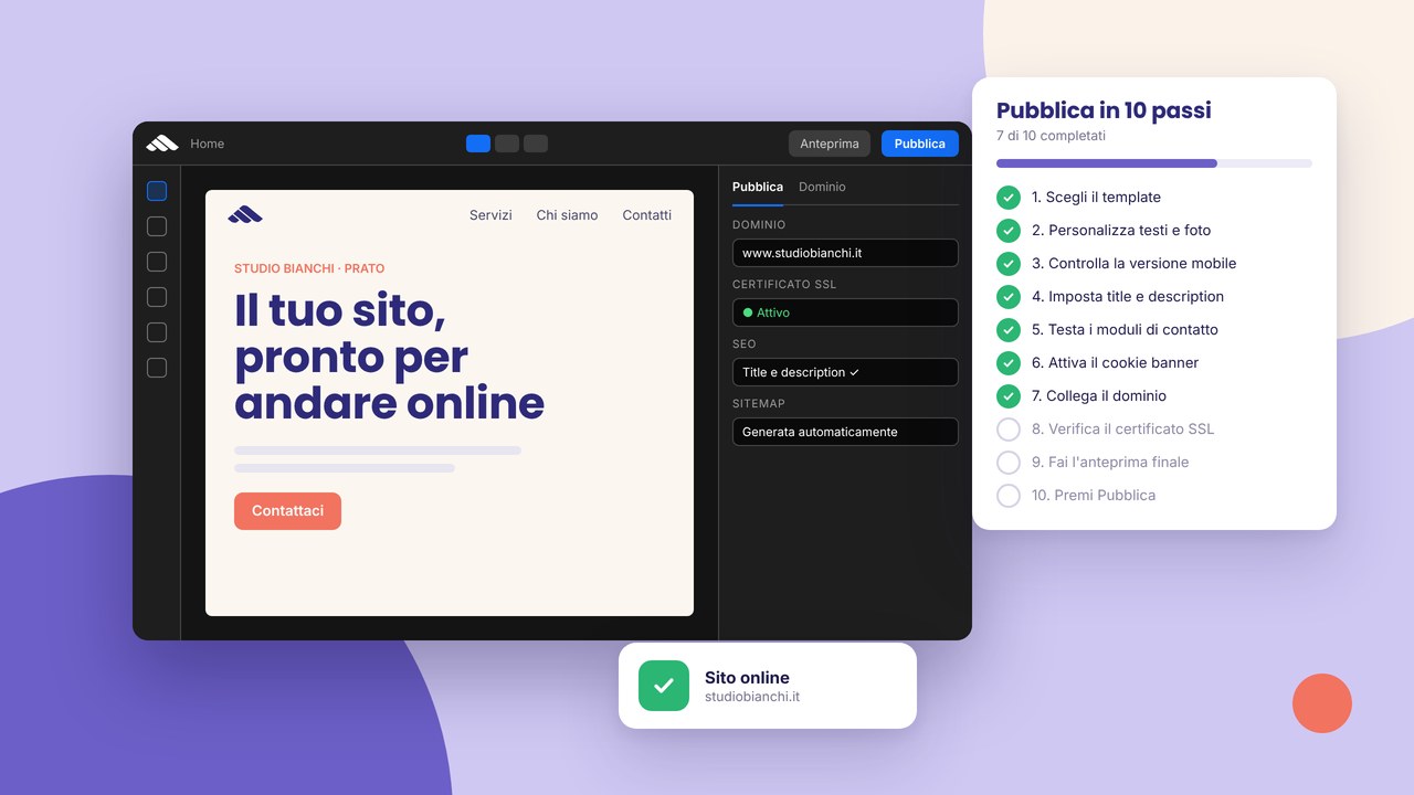
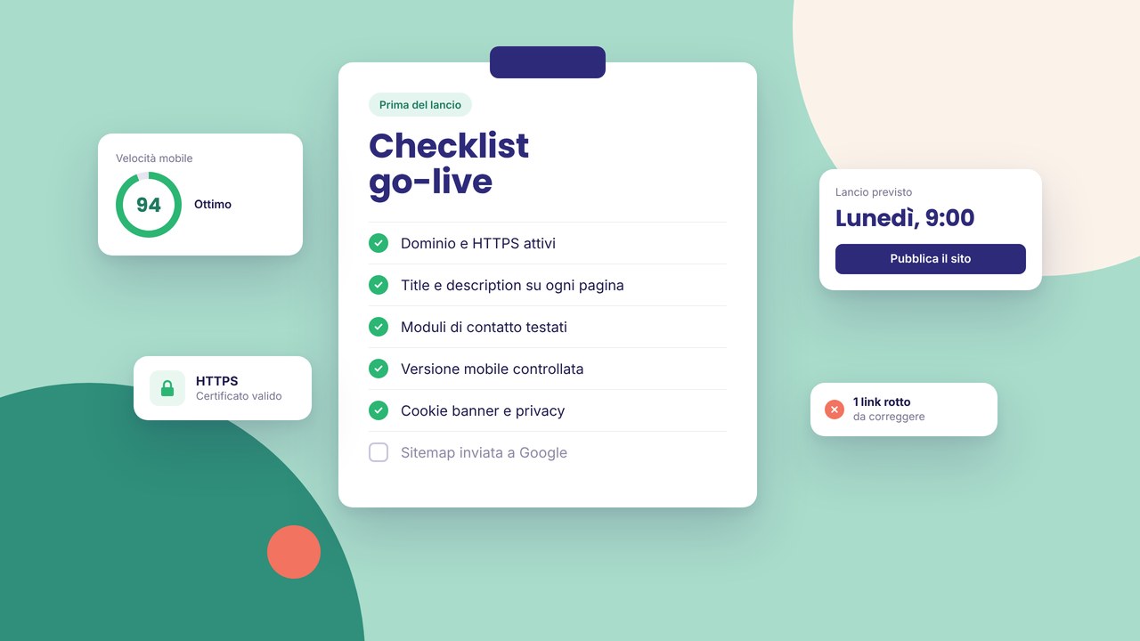
Repeated FAQs? Align the copy with the FAQs on the page and, if you use schema, keep it consistent. Before go-live, use the go-live checklist and publish by following the 10 steps.
Don’t have an account yet? Sign up and try saving the first component on a demo project.
Components in the daily workflow
Think of components as bricks approved by the client or by your design system: you do not rebuild the hero, the services grid or the reviews block every time. In an agency they reduce endless revisions (“on page X the button is different”); as a freelancer they let you deliver more projects in the same month without sacrificing consistency.
If you start from a catalogue template, you often already find modular sections: saving them in the library with clear names turns the template into a reusable kit for seasonal landings or A/B variants. For the overall structure of the site, compare multi-page vs one-page before duplicating components on dozens of unused URLs.
A light design system without Figma being required
Global visual tokens
Primary colours, heading and body fonts, spacing between sections: set them at project level when possible. Components inherit most of the look; you use local exceptions only where needed (e.g. a campaign CTA with an accent colour).
Controlled variants
Instead of cloning “CTA v1, CTA v2, CTA v3” without rules, define two official variants (primary and secondary) and document when to use them. Less chaos in the library, easier onboarding if you work in a team.
Minimal documentation
A comment in the component name or an internal “Style guide” page with screenshots is enough to remember margins and copy types. You do not need a 40-page PDF.
Components for types of site
A creative portfolio: a project grid, a short “About” block, a compact contact form. See also how to create a portfolio site.
SMEs and services: service cards, FAQs, trust (certifications, figures), a CTA towards a business site.
A campaign landing: a single hero, proof, a form — reuse blocks across campaigns as explained in an effective landing page.
A blog: an article header, an author box, a newsletter or related-service CTA; connect the editorial strategy in a professional blog in the builder.
Common mistakes with components
- Saving components too early, before testing mobile
- Generic names (“Section 3”) that make the library unusable
- Changing the master without telling the team, breaking live pages at the next sync
- Duplicating identical FAQs on every page with no added value — a risk of duplicate content for SEO
For SEO alignment between pages, cross-check with SEO mistakes to avoid and with the go-live checklist before you publish.
Components and maintenance over time
A rebrand or a palette change? You update a few masters instead of twenty pages. A new service? You duplicate the existing service card, adapt the copy and the image, and reinsert it. If you migrate from WordPress or from an old site, it is the right moment to clean up dead sections — the comparison WordPress vs a builder explains why you often rebuild with the benefit of clarity.
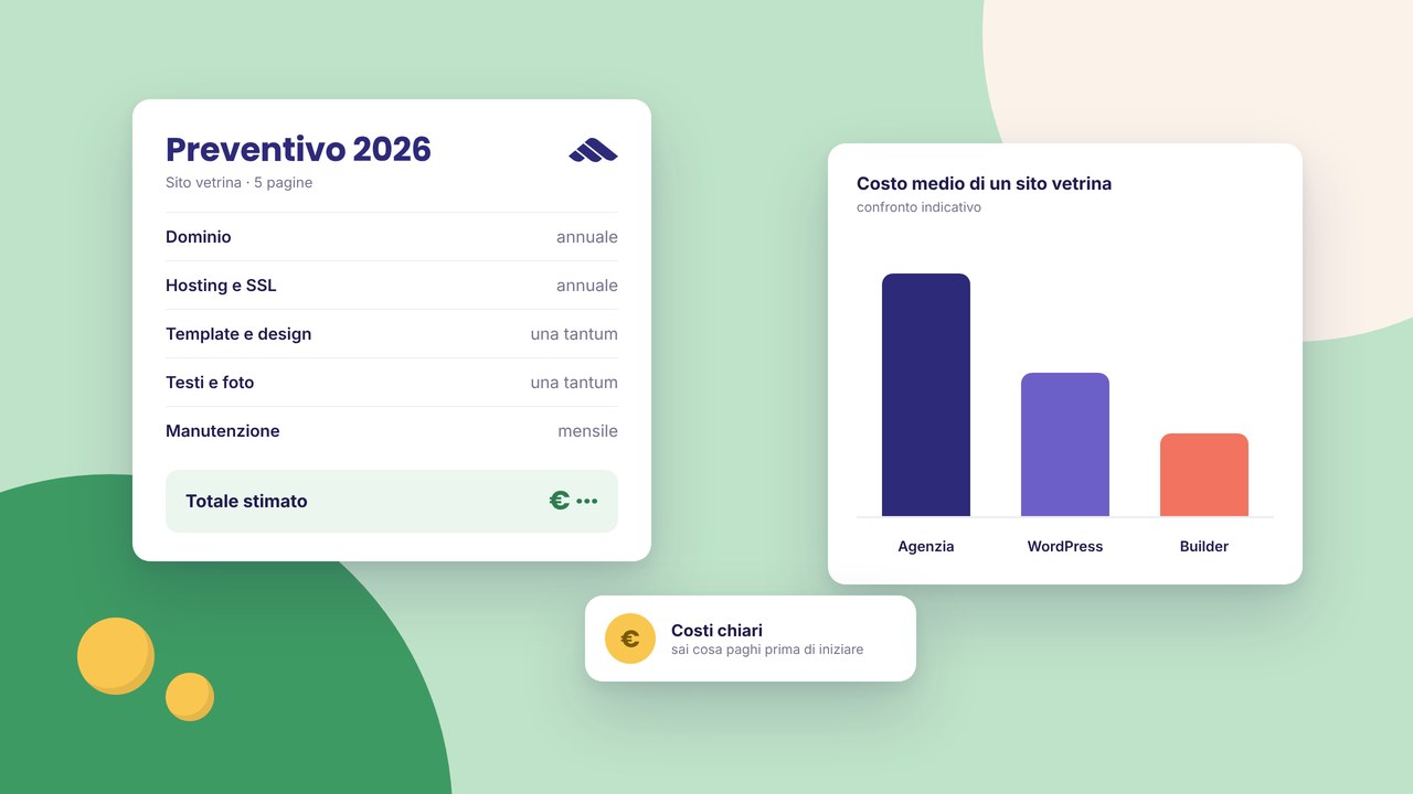
Interactions on menus and panels can live inside header components: to configure them without code, read interactions and animations. The time and budget saved sit in the picture of 2026 site costs.
FAQ
How many components should you have in the library?
Quality > quantity: 8–15 well-named components cover most brochure sites. Beyond that, you need discipline or the library becomes a graveyard of forgotten variants.
If I change an instance, do I lose the link with the library?
It depends on the flow: local changes stay on the page until you update or resync from the master. Before propagating a global fix, check the pages that had intentional overrides.
Do components work well on mobile?
Only if you build and test them on tight breakpoints in the master. A mistake replicated on five pages costs five times the fix time.
Can I use components starting from a template?
Yes: import from the template catalogue, customise, and save the stabilised sections. Then create an account if you do not already have one to manage more projects.
Components vs duplicated pages?
Duplicating a whole page is fine for quick drafts; for repeated elements (footer, FAQs, CTAs) components always win on maintenance and consistency.