Interactions and animations without code
Menus, panels and micro-animations in the builder: when to use them, how not to overdo it, and how to keep the site readable and fast.
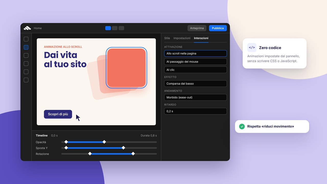
A menu that opens, a side panel, a fade on scroll: interactions make the site feel alive, but used badly they slow it down and confuse people. In the Martini builder you can connect triggers and panels without writing JavaScript by hand — the important thing is knowing when to stop.
Trigger and panel: the basic idea
An element (a button, a hamburger icon) is the trigger; on click it opens a panel (a mobile menu, a modal, a drawer). The same model used on modern professional sites, also documented for the project’s public runtime.
Animations that help UX
- A short transition (200–350 ms) on menu open
- Hover feedback on the main buttons
- A light reveal on key sections (not on every paragraph)
When to avoid them
- Long animations that delay reading
- Effects on every block that compete with each other
- Aggressive pop-ups before the user has understood the site
Accessibility
Focus must stay manageable: anyone using a keyboard must be able to open and close menus and panels. Test Tab and Esc. Also respect prefers-reduced-motion where possible — less movement for anyone who requests it at system level.
Performance
Light CSS animations beat heavy libraries. On 4G mobile, a home page with too many scroll-linked effects can stutter: favour simplicity.
Consistency with the brand
The same easing and duration across the whole site. Save sections with interactions as components so you do not reconfigure them every time.
Second click and close
Expected behaviour: a second tap on the trigger closes the panel. Check it in preview before you publish, together with the go-live checklist.
Next steps
Try it on a demo project: sign up, add a mobile menu with a panel, publish in staging and test on a real phone. For page structure: multi-page.
Why micro-interactions matter
A static site can communicate competence, but visual feedback (hover, menu open, a light scroll) reduces the user’s uncertainty: “did I click?”, “where am I?”. The goal is not to impress with spectacular effects, but to guide towards reading and conversion. On brochure and portfolio sites, a few well-chosen animations separate a generic template from a carefully made experience — without turning to heavy JavaScript libraries.
If you are building from a catalogue template, check which interactions are already included before adding more. Consistency with the brand also comes from uniform duration and easing, which you can save in the header or in sections as reusable components.
Types of interaction in the builder
Mobile navigation
Hamburger → a full-screen panel or a side drawer is the standard. Check that focus is not “trapped” in the closed menu and that the scroll of the page underneath is blocked or handled in a predictable way.
Modals and lightboxes
Useful for a portfolio gallery or an embedded video. Close with Esc, a click on the overlay and a visible icon. Avoid automatic modals on entry — they hurt UX and sometimes SEO.
Scroll reveal
A fade-in or slide-up on hero sections and service blocks: fine if they are discreet. On every title and paragraph it becomes annoying and expensive in performance, especially on a slow mobile connection.
Desktop hover
On a touch device hover does not exist: do not hide critical information only on mouse-over.
Motion design: practical rules
A typical duration of 200–400 ms for UI chrome (menu, tooltip); a scroll reveal can go up to 600 ms but only once per element. Prefer transform and opacity over animating width or top, which force layout. Reduce motion if the user has prefers-reduced-motion: reduce: respect and inclusivity together.
For high-conversion landings, fewer animations often mean more leads — see an effective landing. For event sites or product launches a little more movement can be justified: a site for events.
Tests before you publish
- Desktop Chrome and Safari
- iPhone Safari (menu, panels, modals)
- Keyboard-only navigation: Tab, Shift+Tab, Esc
- A throttled connection (DevTools) on the home page
Build the tests into the go-live checklist and publish with the 10 steps.
Interactions vs SEO and indexing
Google renders JavaScript, but crucial content must not appear only after long animations or required interactions. Service copy, indicative prices and CTAs must be in the DOM and readable without extra gestures. For page structure and consistent headings: meta tags and content.
Inspiration without copying award-winning sites
Study Awwwards sites for motion language, then simplify for your audience (an SME, a professional studio, a restaurant). A legal client does not need scroll-jacking; a creative does need some reveal in the portfolio — a professional portfolio.
FAQ
Do I have to learn JavaScript for interactions in the builder?
Not for standard menus, panels and triggers: you configure them visually. Custom code remains optional for advanced cases.
Do animations worsen the PageSpeed score?
It depends: light CSS has little impact; heavy scroll scripts and huge images do. Give priority to LCP and interaction on mobile.
Can I turn animations off on a single page?
Yes, keep the home sober and use more motion only on a portfolio or campaign page, always testing performance.
A menu that does not close: is it a bug or configuration?
Often the close link is missing on the second click, the overlay or Esc. Review the trigger and the panel states in preview.
Where do I start if I have never used a trigger?
Create an account, duplicate a template with a mobile menu already set up, take the connections apart and put them back together to understand the flow.
A summary: less, but better
Interactions in the Martini builder are there to complete the UX, not to compete with experimental sites. Choose a few patterns (menu, CTA hover, hero section reveals), apply them with consistent durations, test accessibility and mobile, and save in components what you repeat. Publish only after the go-live checklist and compare real metrics: if the home slows down or conversions drop, simplify before adding more effects.
For a comparison with stacks that need animation plugins on WordPress, read WordPress vs a builder and for project budget 2026 site costs: well-made motion should not increase maintenance hours or client tickets.