Social graphics and your website: the same visual identity
Why social posts, landings and the site must have consistent colours, tone and visuals. A practical method for brands, campaigns and local businesses.
Social graphics and the website are often treated as two separate worlds: on one side Instagram, LinkedIn posts and campaigns; on the other the home, service pages and contact forms. In reality, for a client they are the same experience. If they see an ad with one style and arrive on a completely different site, trust drops. If instead colours, tone, images and messages are consistent, the brand becomes more recognisable and the path towards contact more natural.
This guide explains why the website and social content must share the same visual identity, how to organise it and which mistakes to avoid when you work with templates, campaigns and promotional materials.
Visual consistency is not only aesthetics
A consistent identity reduces friction. The user understands immediately that they are in the right place: the post they clicked, the landing they visit, the site they explore and the newsletter they receive speak the same language. This applies to structured companies, but also to shops, professionals, studios and local businesses.
Consistency helps on three levels:
- Recognisability: people associate colours, style and tone with your brand.
- Trust: a carefully made image communicates attention and professionalism.
- Conversion: the passage from social to the site is more fluid and less “suspicious”.
The problem: beautiful social, a weak site
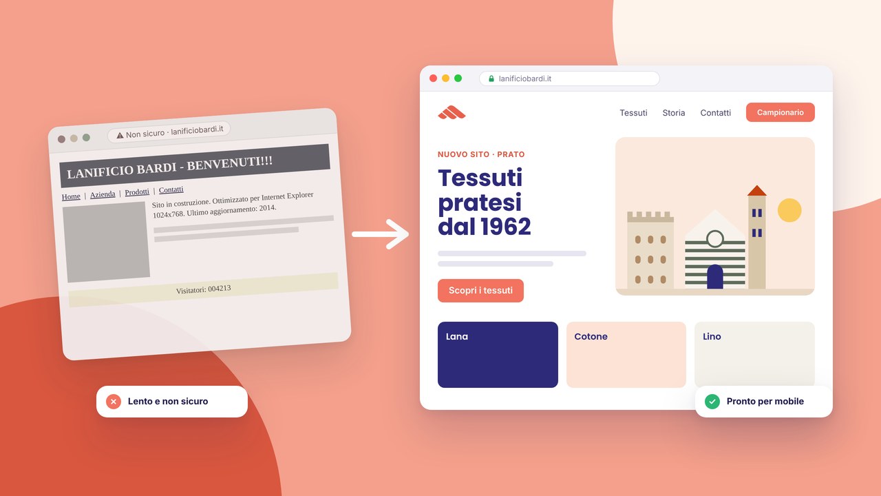
It often happens: a carefully made Instagram feed, well-designed posts, orderly promotional graphics. Then the user clicks the link and arrives on an old, slow site, with different fonts and generic messages. The result is a broken promise. The social graphics create an expectation, but the site does not confirm it.
The opposite problem is less evident but equally damaging: a carefully made site and improvised social, with casual colours and different templates every week. In this case the brand seems less solid and every piece of content starts from scratch.
What must be aligned
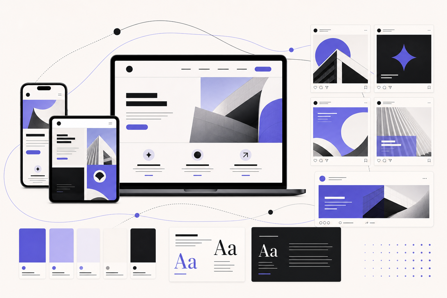
You do not need to make everything identical. You need to create a recognisable system. The main elements are:
- Colour palette: primary, secondaries, backgrounds, colours for CTAs and states.
- Typography: fonts, weights, titles, short texts, hierarchies.
- Image style: real photos, mockups, illustrations, textures, colour treatment.
- Layout: grids, margins, cards, use of white space.
- Tone of voice: direct, technical, elegant, informal, local.
- CTAs: consistent texts and promises between post, landing and site.
If you want to start from the basics of the visual system, look at brand identity and colours and style.
From the post to the site: the path must feel continuous
Imagine a social campaign to promote a service. The post promises “site restyling for local businesses”, uses a blue/violet palette and shows an elegant mockup. The click should lead to a page with the same mood, the same language and the same benefit. If the landing completely changes style, the user unconsciously wonders whether they have ended up in the right place.
That is why social campaigns work better when they land on dedicated pages or well-aligned service sections. For example: a campaign on digital presence can lead to the website, a visual campaign to social graphics, an identity campaign to brand identity.
Social templates: useful only if they are part of a system
Templates for posts and stories are very useful: they save time and keep order. But if every template is born in isolation, after a few weeks the feed becomes a collection of experiments. The social kit should derive from the site or the brand system:
- the same main colours;
- the same logic of titles and subtitles;
- the same icons or illustration style;
- CTAs consistent with those of the site;
- variants for educational content, promotions, testimonials and announcements.
It is the reason why the social media service is linked to web design: the social visual should not live separately from the site.
SEO and social: why consistency also helps Google
Social does not replace SEO, but it can strengthen the path. A post brings traffic, the site collects indexable content, the blog answers questions, the service pages consolidate the keywords. If every channel tells the same value with different but consistent words, Google and users find clearer signals.
For example, if you work in Prato and in Tuscany, the site can have pages optimised on local services, while social shows cases, backstage, before/after and testimonials. The local strategy is explained in local SEO in Prato and Tuscany.
Seasonal campaigns: the riskiest case
Seasonal campaigns often are born in a hurry: sales, events, promotions, launches, fairs. The risk is to create beautiful graphics that are disconnected from the site. Before you publish, ask yourself:
- does the arrival page pick up the promise and the visual of the campaign?
- does the button use the same language as the post?
- do the images seem part of the same brand?
- is the form or contact immediate?
- is the page fast on mobile?
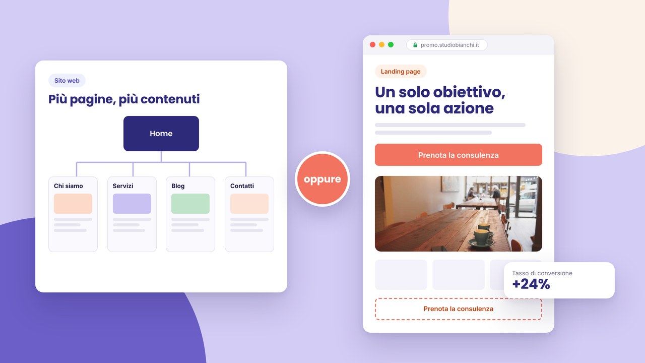
If the campaign has a single goal, consider a dedicated landing: website or landing page.
How to build a practical mini brand kit
You do not need a fifty-page manual. To start well, clear rules are enough:
- Palette: 3-5 colours with precise use (background, text, CTA, accent).
- Fonts: titles, text, any decorative font only if it is readable.
- Social grid: square post, story, reel cover, LinkedIn banner.
- Web components: hero, card, FAQ, CTA, testimonial.
- Image style: photos, mockups, filters, crops and proportions.
- Recurring messages: headline, payoff, button microcopy.
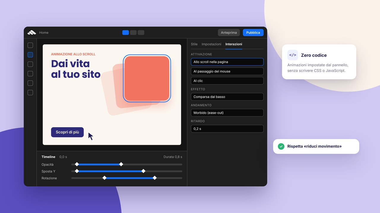
In the builder, the components help you keep consistency between pages. On social, the same principle becomes a reusable template.
Common mistakes to avoid
- Using too many fonts: every post seems to belong to a different brand.
- Changing the palette with every campaign: recognisability does not grow.
- Very carefully made posts and a generic landing: the click loses trust.
- Different CTAs without a reason: “Discover”, “Buy”, “Contact us” used at random.
- Templates that are not responsive: visuals that look good on desktop but the mobile site does not hold up.
- Inconsistent stock images: photos with completely different lights, people and styles.
When to redo the site first and when the social first
If the site is very old, slow or no longer communicates well, it is better to fix it first: it will be the base for social, landings and campaigns. If instead the site is already solid but the social communication is disordered, you can start from a social graphic kit aligned with the existing identity.
In many cases the best path is combined: definition of the identity, an update of the main pages and a reusable social kit. That way every channel supports the other.
A consistency checklist for site + social
- Do the post and the arrival page use the same promise?
- Are colours and fonts recognisable?
- Does the CTA of the post correspond to the CTA of the page?
- Does the visual of the campaign also appear on the site or landing?
- Is the mobile page fast and readable?
- Does every piece of content point to a clear next step?
- Do you have reusable templates for posts, stories and web sections?
Next step
If you want to make site, social and campaigns consistent, start from a simple audit: open the social profile, the home and a service page. Do they look like the same brand? Is the message the same? Does the button lead to a consistent page?
If the answer is uncertain, we can build a single path between social graphics, brand identity and the website. To understand priorities and budget, request a consultation.