The psychology of web design: how design influences user behaviour
Web design is not only about aesthetics, but also about users’ perception and behaviour. Discover how psychological principles can improve the usability and effectiveness of a website.
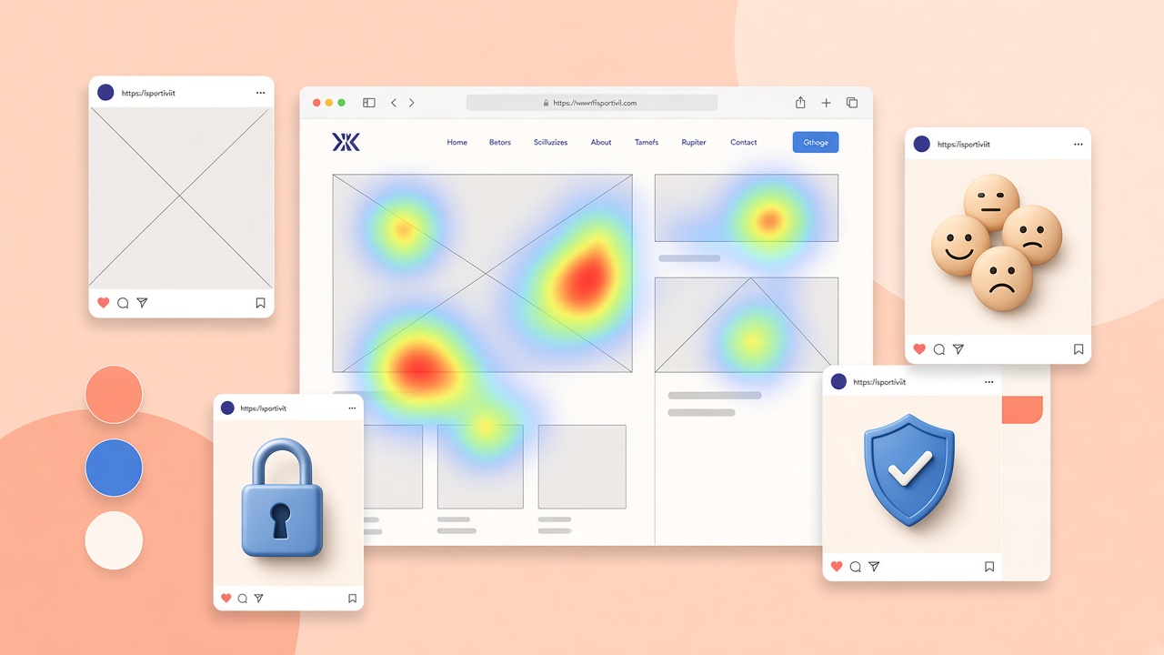
Web design is not only an aesthetic matter: it directly influences how a user perceives a brand, how easily they find their way around a page and how inclined they are to take an action. When you know the psychological mechanisms behind attention, decisions and behaviour, you can design interfaces that are clearer, more pleasant to use and more effective in terms of conversions.
Here are the principles of psychology applied to design that, if used with awareness, really make the difference between a site that confuses and one that guides the user towards the goal.
Visual hierarchy: guiding the gaze
Visual hierarchy serves to direct the user’s eye towards what matters: the title, the main message, the call to action, the key information. A page without a hierarchy forces the user to “search”, and when they have to search… they often leave.
To build it effectively, size, contrast, colour and placement play a fundamental role. Larger or more evident elements are perceived as more important. White space organises reading and separates sections without creating confusion.
A practical example: on a landing page, the headline occupies the upper part with a large font and high contrast, the subtitle explains the benefit in a concise way, and the primary button is the only coloured element in that section. Everything else stays neutral so as not to compete with the main action.
Fitts’s Law: simpler interaction
Fitts’s Law establishes that an element is easier to click if it is large and close to the point of interaction. Buttons that are too small, too close to each other or placed in uncomfortable corners increase errors and frustration.
In modern design this translates into:
- Well-visible CTAs with a generous clickable area (a minimum of 44×44 pixels on mobile).
- Adequate spacing between links and buttons to avoid accidental taps.
- Strategic placement of the most used controls in the zone reachable with the thumb.
On mobile, where the user does not have the precision of a mouse, respecting Fitts is not an aesthetic detail: it is a fundamental usability choice.
The Hick-Hyman principle: fewer choices, faster decisions
The more options you offer a person, the more you slow down their decision. You increase mental effort: the user has to evaluate, compare, doubt. Overly rich menus, pages full of alternatives and a checkout with too many variants often worsen the results.
A good design simplifies: it shows few but clear choices, guides with priorities and reduces visual noise. Amazon, for example, limits the options in the checkout by showing a linear path. Netflix presents a few titles in evidence instead of an infinite catalogue on the homepage.
The practical rule: every screen should have a clear primary goal. Secondary options can exist, but they must not compete with the main action.
The psychology of colour: emotions and expectations
Colours do not communicate only style: they communicate sensations and expectations. There is no universal rule valid for every context, but some associations are frequent:
- Blue: reliability, security, professionalism (banks, tech, healthcare).
- Red: energy, urgency, passion (promotions, temporary calls to action).
- Green: wellbeing, growth, sustainability (health, finance, eco-brands).
- Orange: enthusiasm, creativity, accessibility (friendly CTAs, e-commerce).
The point is not to choose “magic” colours, but to use them in a way consistent with the tone of the brand and with the goal of the page. A red button on a red background does not convert: contrast and consistency matter more than the colour itself.
The Zeigarnik effect: the push to complete
People tend to remember what has remained incomplete and often feel an internal push to “close it”. On the web this is an enormous advantage, especially in forms and onboarding.
Progress bars, clear steps and feedback on completion help the user not to give up halfway. LinkedIn shows the percentage of profile completion. Multi-step forms with progress indicators increase completion rates compared with monolithic modules.
If an action is interrupted, targeted reminders or the possibility of picking up from the exact point can increase return and conversion.
Gestalt: proximity and grouping
According to Gestalt principles, elements close to each other are perceived as linked. If you put related information far from each other you create confusion; if you group them visually you make everything more readable and intuitive.
White space is an ally: it does not “waste space”, but organises, separates and makes clearer what the user is looking at. Well-delimited cards, boxes and sections help you scan a complex page quickly.
Cognitive consistency and trust signals
Users feel better on sites that respect common expectations: menus where you expect to find them, buttons that behave like buttons, familiar patterns. Consistency does not mean being banal: it means not forcing the user to learn the site from scratch.
Trust signals strengthen the perception of security and credibility:
- Verifiable reviews and testimonials with a name and a photo.
- Partner logos, certifications and security badges (SSL, protected payments).
- “About us” pages, visible contacts and a clear privacy policy.
- Carefully made design, an absence of evident errors and rapid load times.
A site that appears professional and transparent reduces purchase anxiety and increases the probability that the user will take the desired action.
The principle of scarcity and urgency (with ethics)
The perception of scarcity or urgency can accelerate decisions: “Last 3 places available”, a countdown for limited offers, stock running out. Used honestly, these elements can be effective. Used in a manipulative or false way, they destroy trust and damage the brand in the long term.
Conclusion
Applying psychology to web design means designing with more awareness. It is not only about “making it beautiful”, but about making the pages clearer, more intuitive and more effective. When you understand how people read, choose and interact, you can build experiences that work better: less friction, more trust, more concrete results.