Micro-interactions in Web Design
How to design effective micro-interactions in web design: feedback, motion, accessibility, microcopy, a design system and tests with real users to improve UX and conversions.
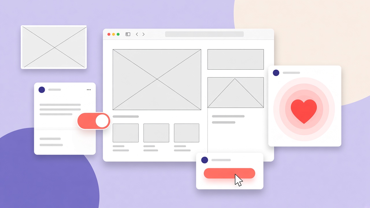
People remember the “how” more than the “what”. In web design, this “how” is the micro-interactions: tiny but decisive pieces of feedback that guide, reassure, make it clear what is happening. A button that compresses on click, a clear success message, a skeleton that appears during loading: details that increase trust, understanding and conversion.
What a micro-interaction is (and why it matters)
A micro-interaction is a unitary event with a trigger (a user or system action), a rule (what happens), feedback (how you communicate it) and states (start, transition, end). It serves to:
reduce anxiety (“the system has received the action”),
make the interface more predictable,
offer state signals (loading, success, error),
give pleasure of use without distracting.
Where to insert them to maximise the impact
1) Buttons and controls
Clear hover/press: size, shadow or colour that changes.
Understandable disabled states (adequate contrast + a tooltip if needed).
Toggle: fluid transitions between on/off with a text label for accessibility.
2) “Courteous” loadings
Skeleton screens instead of infinite spinners: they give a sense of speed.
A real progress bar for operations over 2–3 seconds.
Concrete status texts: “Loading 12 of 50 images”.
3) Forms that really help
Real-time validation and messages next to the field.
Password-strength indicators and tickable requirements.
Autofocus and focus management: after submit, take the gaze to the first error.
4) Success and error messages
Immediate micro-feedback (a ✓ check, a confirmation colour).
Useful errors: explain what to do, not only “Something went wrong”.
Undo/Cancel when possible (e.g. deletions).
5) Empty states
Do not leave deserted pages: explain what can be done and offer a first step (a CTA or a quick import).
6) Navigation and orientation
A clear active link and a readable breadcrumb.
A back-to-top that appears only when it is needed.
Section indicators on long pages (a sticky subnav).
7) E-commerce & key actions
Add to cart with visual feedback + an updated mini-basket.
Saving favourites with a micro-animation and a counter.
A step-by-step checkout with progress indicators.
Motion with judgement (not “because it is pretty”)
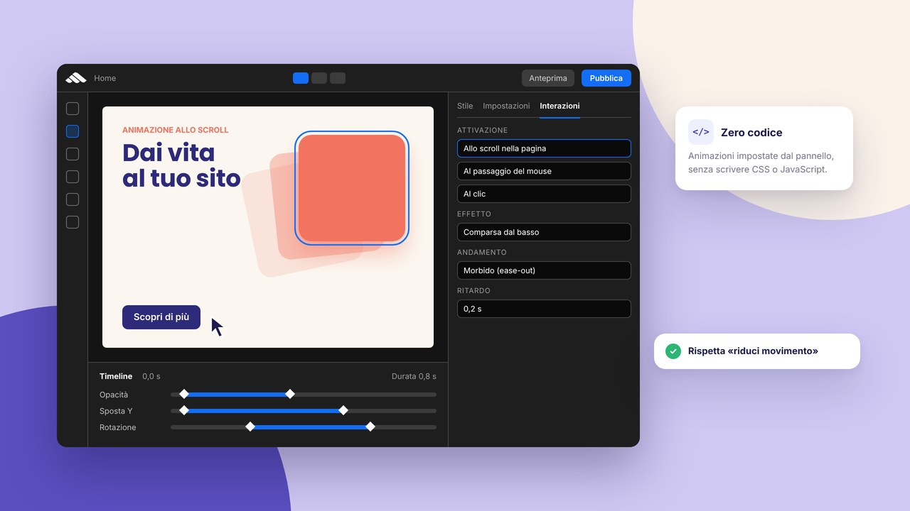
Duration: 150–250 ms for click feedback; 300–500 ms for section transitions.
Hierarchy: the main elements move less and better; no fireworks.
Consistency: the same durations, the same easing curves, the same patterns everywhere.
Meaning: every animation must tell a state (arrival, waiting, outcome).
Accessibility first of all
User preferences: respect prefers-reduced-motion by reducing non-essential motion.
Sufficient contrast also in hover/focus/disabled states.
Focus visible always present (and beautiful, not the default ring that is invisible on light backgrounds).
Not only colour: use icons and text to communicate state and error.
Screen readers: announce important state changes (loading started/finished, a field error).
Microcopy: the voice that guides
Be concrete and short (“File uploaded successfully” > “Operation completed”).
Avoid blaming: “Check the password” > “Incorrect password”.
Anticipate the next action: “Account created. Check your email to confirm”.
Performance and perception
Micro-interactions work if the interface stays responsive:
lazy-load what is not needed immediately,
use optimised images (WebP/AVIF) and real sizes,
favour above-the-fold content and intelligent skeletons,
keep local state where possible to avoid flicker.
A design system: how to make them scalable
Define tokens for durations, easing, shadows, radii, spaces.
Prepare standard states for components (default, hover, active, loading, success, error).
Document usage guidelines: when to animate, how much and why.
Run visual reviews: consistency first, creativity later.
A ready-to-use checklist
- Every action has visible feedback in < 200 ms
- Loading: contextual skeletons/indicators, not generic spinners
- Forms: inline validation, clear messages, focus on the first error
- Success/error: icon + colour + useful text (+ undo if possible)
- An empty state with a call-to-action
- An accessible and consistent focus state
- Consistent motion (durations/easing) and reduced if the user asks for it
- Concrete microcopy oriented towards the next step
- Components and tokens documented in the design system
- Performance taken care of: no animations that “grain” the experience
Concrete examples of effective micro-interactions
Some proven patterns that work on modern sites and apps:
- Like/favorite: a short animation + a colour change + an updated counter
- Copy to the clipboard: an icon that becomes a check for 2 seconds + a “Copied” toast
- File upload: a real progress bar + a thumbnail preview on completion
- Search: suggestions as you type, highlight of the term in the results
- Dark mode toggle: a soft 200 ms transition between themes, not a white flash
Study how Stripe, Linear, Notion or your direct competitor solve them: not to copy, but to understand which feedback the user now expects as a standard.
How to test micro-interactions with real users
Micro-interactions are validated with rapid tests, not with months of research:
- The 5-second test: show a state (loading, error, success) and ask what the user understands
- Think aloud: observe where the person hesitates or does not understand the feedback
- Metrics: form abandonment rate, task completion time, repeated errors on the same field
- Accessibility: try with a screen reader and with
prefers-reduced-motionactive
Iterate on duration, copy and visibility of the feedback. A micro-interaction that confuses is worse than no micro-interaction.
Integration in the design system
To scale, document in the design system:
- Motion tokens: consistent durations, easing, shadows
- Standard component states for button, input, toast, modal
- Do/don’t examples with screenshots or short GIFs
- Rules for reduced motion: which animations to disable, which to replace with a static fade
In code, prefer CSS transitions and @media (prefers-reduced-motion: reduce) over heavy JS animations. GSAP or Framer Motion are fine for complex cases, but 80% of feedback is solved with well-set CSS transitions.
Micro-interactions and brand identity
The way an interface reacts communicates personality: soft transitions and elastic curves suggest friendly; immediate snaps and sharp colours communicate efficiency and precision. Align duration, easing and copy with the tone of the brand. A legal or medical site will not use the same feedback as a gaming app, and vice versa.
Conclusion
Micro-interactions are not decorations. They are trust contracts between interface and person: I tell you what is happening, I guide you to the next step, I help you avoid errors. Done well, this invisible layer reduces friction, increases conversions and makes your brand more credible. In 2025, the web design that works is the one you feel at a touch… even through a screen.