Fundamental principles of Web Design
Explore the best web design practices to create visually beautiful and functional sites, with a focus on UX, UI, responsive design and accessibility.
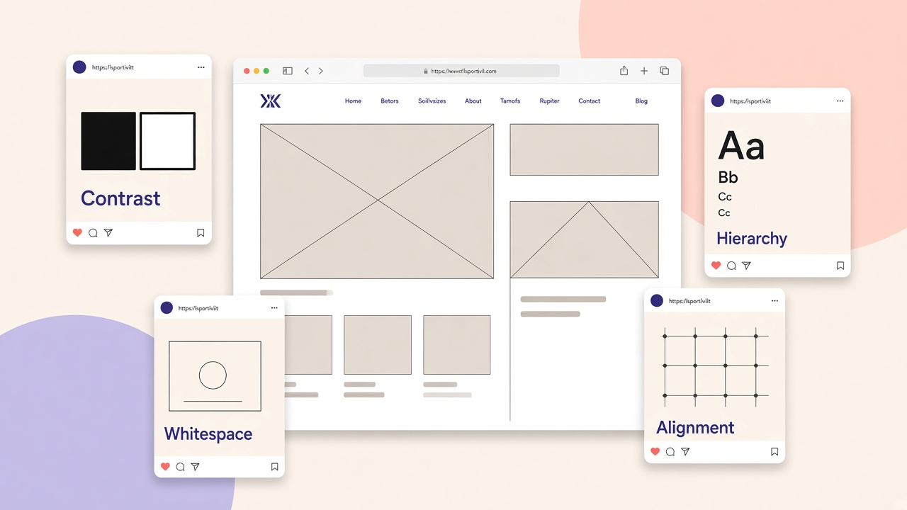
A good web design is born from the balance between aesthetics and functionality. A site can be very beautiful, but if it is hard to use or slow to load the user leaves. On the contrary, a very “clean” site but confused in the structure does not communicate trust and does not bring results. That is why there are fundamental principles that, if respected, make any project more solid, professional and pleasant to browse.
UX and UI: two levels, one single goal
UX (User Experience) concerns how the user perceives the path: how easy it is to find information, complete an action or go back without frustration. UI (User Interface) concerns the visual aspect: colours, typography, buttons, icons and spacing. A carefully made interface without a clear UX remains superficial; a well-thought UX without a consistent UI loses credibility. The best work unites both from the wireframe phase.
Usability and accessibility
Usability and accessibility are the first point to start from. A site must be immediate to understand, with clear navigation and a visual hierarchy that guides the gaze. The user should never wonder where to click or how to go back. The experience must be inclusive: adequate contrasts, readable texts, correct spacing and images with descriptive alt help anyone with specific needs and also improve understanding by search engines.
A quick accessibility checklist:
- a minimum contrast between text and background (level AA as a reference)
- visible focus on links and buttons for anyone who navigates from the keyboard
- clear labels on forms, not only placeholders
- a semantic structure with ordered headings (
h1,h2, etc.)
Responsive design
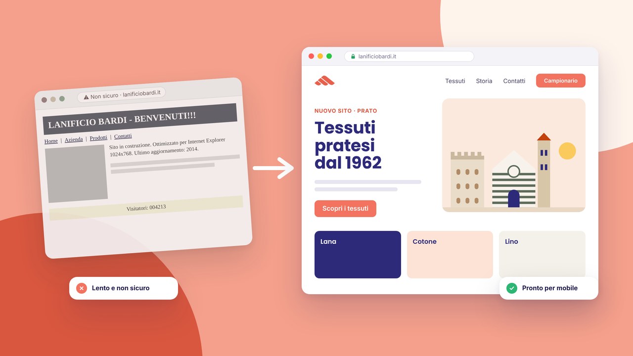
Responsive design today is not an option, it is a standard. A large part of the visits arrives from smartphones and a site must adapt naturally to every screen. It means layouts that resize without breaking, images with correct proportions and components comfortable to use with a touch. A well-done responsive is not “reducing everything”, but rethinking spaces, priorities and the arrangement of the elements based on the context.
Speed and performance
Speed and performance have an enormous impact on UX and SEO. A slow site communicates little care and reduces conversions. Images must be optimised, CSS and JavaScript kept light, and when possible it is worth taking advantage of cache and techniques that reduce useless requests. Speed is part of the perception of the brand, not only a technical detail.
Visual consistency and branding
Visual consistency makes a site immediately recognisable and professional. Colours, typography, image style, buttons, spacing and icons must speak the same language. When a site keeps the same identity on all pages, the user finds their way better and trusts more. Branding is not only a logo: it is a visual system that repeats itself with consistency.
Effective calls to action
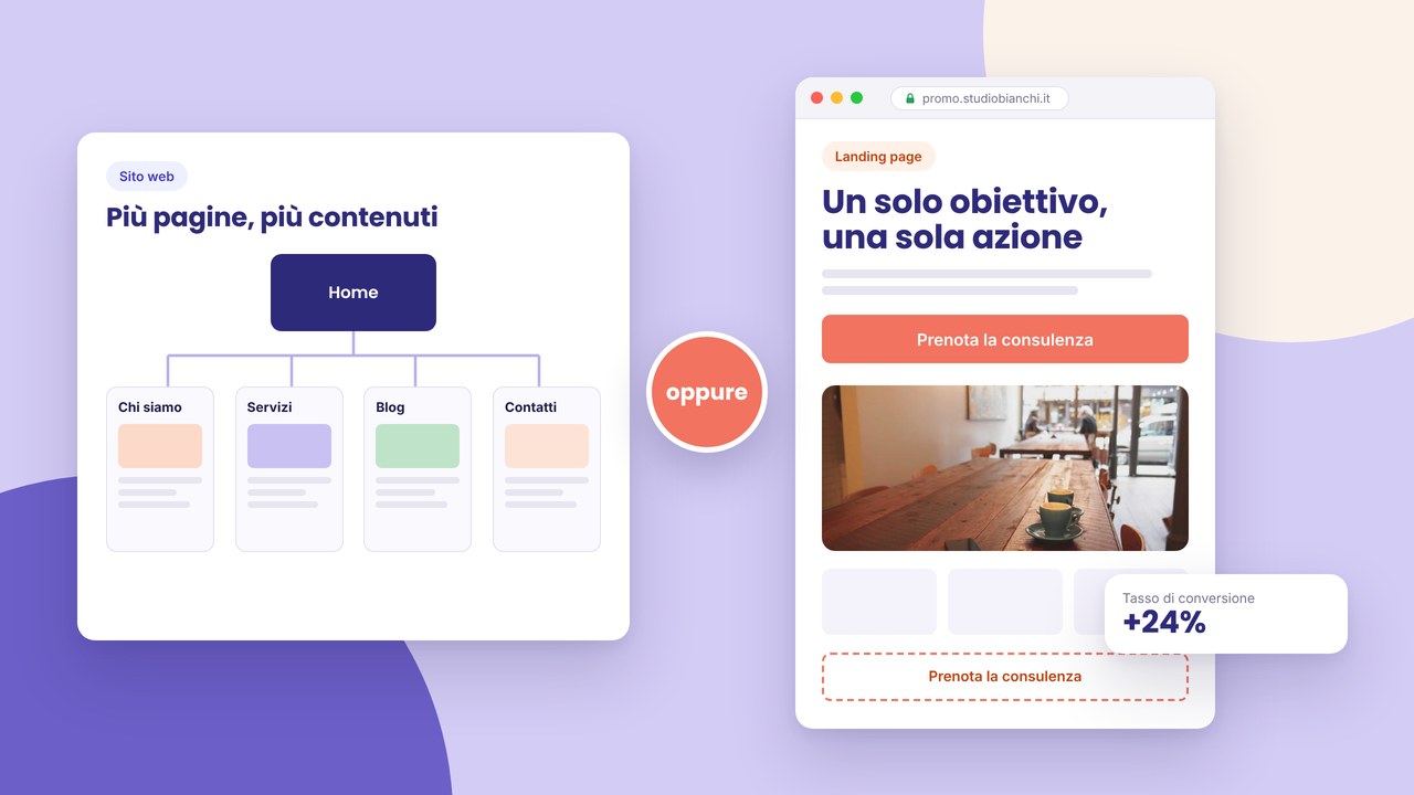
Calls to action are the bridge between navigation and the result. A site must guide the user towards precise actions: requesting a quote, signing up to a newsletter, buying a product. An effective CTA is noticed immediately, is placed at the right moment and uses a clear text that communicates value. It must not be aggressive, but visible and consistent with the goal of the page.
Content structure and SEO
The structure of the content and SEO are also part of web design. A well-designed site makes the content easy to read and to scan, with ordered headings and clean URLs. SEO is not “inserting keywords”, but building an experience and a structure that help both the user and Google understand what the page is about and why it deserves to rank.
Essential tools for web design
To design and build modern sites there are tools that make the work faster and more precise:
- Figma and Adobe XD for interfaces, components and interactive prototypes
- WordPress or Webflow for anyone who wants to develop with different but valid approaches
- Google Fonts and libraries such as Font Awesome for consistent typography and icons
- PageSpeed Insights and GTmetrix to identify bottlenecks on performance
Common questions about web design
Where do you start? Understand the goal of the site and the reference audience. Without this base, even the best design risks being “beautiful but useless”. Then a wireframe or mockup, a visual identity and development with tests on different devices before publication.
How do you improve UX? Make the site fast, reduce confusion, decrease the steps to arrive at the important information and make sure that on mobile everything is comfortable and readable. The user must feel guided, not forced to understand on their own.
Mistakes to avoid
- too many colours and different fonts on the same page
- complicated navigation or hidden menus without a reason
- a lack of mobile optimisation
- heavy images that slow loading
Conclusion
Web design is not only about aesthetics: it is design of the experience. An effective site loads quickly, is understood in a few seconds, guides the user naturally and keeps a consistent visual identity. Taking care of usability, performance, branding and the structure of the content makes the difference between a “nice” site and a site that communicates value, generates trust and brings concrete results.
Prototyping and tests with users
Before developing the whole site, it is worth validating the choices with wireframes and clickable prototypes. A test on a few real users — even informal — can reveal points of confusion that on your own you do not see. Observe where they stop, what they look for and which actions they complete without hesitation. Small adjustments in the design phase cost less than corrections after launch.
Elements to test in the prototype:
- clarity of the main menu and of the path towards the key pages
- readability of the texts on mobile and desktop
- visibility of the CTAs compared with the surrounding content
- the perceived time to find contact information or prices
A design system and scalability
When the site grows, a light design system (palette, typography, spacing, button and card components) avoids every new page inventing different rules. You do not need an enormous manual: shared tokens and a few repeated patterns are enough. This accelerates development and design and keeps consistency even months later.
Typography and visual hierarchy
The choice of fonts and sizes guides reading even before the colours. Limit the families to one or two, define scales for titles and body (e.g. a 16px base, a 1.25 ratio for the levels), and keep a comfortable line length (45-75 characters). Titles that promise and texts that keep the promise increase time on the page and trust.
Micro-interactions with moderation
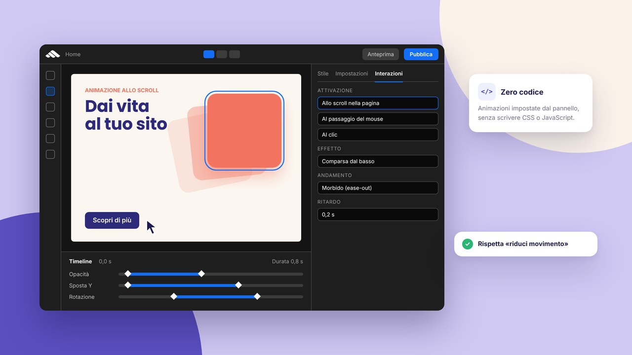
Hover animations, transitions on menus and feedback on click improve the perception of quality if they are rapid and consistent. Avoid effects that slow, disturb or repeat on every element: less is often better, especially on mobile and for anyone who prefers reduced motion.
Conversion and trust
Besides CTAs, elements such as verifiable testimonials, client logos, concrete numbers and clear legal pages (privacy, cookies) reduce hesitation. The design must support the decision, not only attract the gaze.
Colour palettes and perceived psychology
Choose primary and secondary colours in a limited number; use neutrals for backgrounds and texts. Check WCAG contrast. The primary colour of the brand on CTAs and links creates recognisability; avoid rainbows that compete for attention.