Fonts for websites: how to choose the right ones
A complete guide to web typography: readability, brand, Google Fonts, licences, performance, mobile testing and ready-to-use pairings.
Typography is 90% of the web: before colours, animations and photos, users read. The choice of fonts impacts brand perception, usability and conversions. The goal is not to amaze: it is to let the content flow without friction, with a clear hierarchy and light load times.
Readability: the basis of every choice
Prefer modern families with a good x-height (the height of the lowercase letters), balanced weights and a clean design on small screens. For long texts use a base size between 16 and 18px and a line height between 1.4 and 1.6: the eye does not “jump” between the lines. Avoid weights that are too light on light backgrounds and letters that are excessively condensed: they tire quickly.
- Ideal line length: about 60–75 characters for blog paragraphs.
- Alignment: left for body; centred only for short titles or the hero.
- Colour contrast: respect WCAG AA (4.5:1 for normal text).
Brand voice: what each family communicates
The typeface tells who you are:
- Sans-serif (Inter, Source Sans, DM Sans): contemporary, neutral, excellent for UI and long texts.
- Serif (Lora, Merriweather, Fraunces): authority, editorial, warmth.
- Display: titles only, in minimal doses; never for paragraphs.
- Variable fonts: one file, more weight/width axes; fewer HTTP requests if they are configured well.
Consistency > extreme originality: a corporate site with an eccentric body font can seem unreliable.
A simple typographic hierarchy
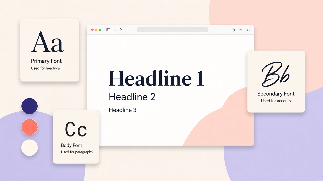
Two levels are often enough: titles and text. Add a third for micro-titles or callouts. Use 2–3 weights (Regular, Medium/Semibold, Bold) and a scale in rem for stable proportions on mobile.
A scale example:
h1: 2–2.5remh2: 1.5–1.75rem- body: 1rem (16px)
- small/caption: 0.875rem
The reader must understand at a glance where to start and what is secondary.
Google Fonts and similar services
Google Fonts is the most widespread choice: a wide catalogue, simple integration, a fast CDN. Good practices:
- Select only the weights used (e.g. 400, 600, 700), not the entire family.
- Prefer the latin subset if other alphabets are not needed.
- Consider font-display: swap to avoid invisible text during loading.
- Alternatives: Fontshare (free for commercial use), Adobe Fonts (with a Creative Cloud licence), self-host for total control.
Self-hosting (WOFF2 files on your server) improves privacy and cache control, at the cost of manual updates.
Licences: what to check before go-live
Not all fonts are free for every use. Always check:
- Desktop vs web licence: a font bought for Photoshop is not enough for @font-face on the site.
- Traffic/pageviews: some foundries (e.g. some commercial plans) limit impressions.
- Embedding in an app/PDF: different rules from the site.
- Google Fonts / Fontshare: generally open source or SIL Open Font License; still read the font’s sheet.
For enterprise clients, keep a screenshot or PDF of the licence in the project file.
Performance: fonts weigh if you ignore them
Fonts can cost more than images if they are loaded badly:
- WOFF2 format as the standard.
font-display: swap+ similar system fallbacks (e.g.system-ui, -apple-system, "Segoe UI", Roboto, Inter, sans-serif).- Preload only for the critical above-the-fold weight (e.g. Regular 400 of the body).
- Avoid 5 families and 12 weights: each file adds latency.
Tools: Lighthouse, WebPageTest, the DevTools Network panel to see KB and the waterfall.
Testing on mobile and real devices
Typographic design is validated on inexpensive phones, not only on a 27-inch monitor:
- Check minimum tap-target sizes (44px) on buttons with text.
- Check horizontal overflow on long titles (hyphens,
word-breakwith caution). - Try sunlight and energy-saving mode: contrast and weight must hold up.
- Read a real paragraph out loud: if you lose the thread, the line height or the column width is wrong.
Risk-free pairings
Solid, ready combinations:
- Inter (text) + Lora (titles): modernity and editorial warmth.
- Source Sans 3 alone, 3 weights: clean, versatile, zero friction.
- Outfit (titles) + Inter (texts): geometric but readable.
- DM Sans + DM Serif Display: a coordinated family for carefully made brands.
The rule: a maximum of two families (three only if the display is minimal). More consistency, less weight, simpler maintenance.
Accessibility and micro-typography
- Avoid paragraphs entirely in uppercase; on buttons increase letter-spacing.
- Do not use colour as the only distinction between links and text.
- Headings in a logical order (h1 → h2 → h3) for screen readers.
A recommended workflow on a project
- Choose fonts and weights in Figma with the client’s real copy.
- Export/specify CSS with fallbacks and tokens (
--font-body,--font-heading). - Measure performance before and after go-live.
- After 30 days, review analytics: time on page and scroll depth on textual pages.
In short: a reliable sans for the copy, optionally a soft serif for the titles, few weights, a clear licence, optimised loading and mobile testing. Typography must not draw attention to itself: it must make the content and your identity work well.